
When learning a new skill, a good practice is to find an established method that will help you learn more quickly and effectively. For artists, there are many such methods, including values studies, which help you build skills in composing an interesting painting, blocking out forms, and leading the eye to the most important part of the picture.
A values study is a painting study that distills a composition
to form (shape) and adds a limited range of values from black to white.
It’s a great way to practice composition, lighting, and storytelling skills for illustration.
Values studies are not only good exercises to practice these skills. Many painters use a values study to test a composition before committing to a full painting, saving time and effort as values studies show weakness in the composition. It’s easier by far to fix such weaknesses at this stage than in the middle of a painting, even for digital artworks.
Today I have tips from two more values studies to share with you. If you’re also learning to paint, I hope they will be useful for you. And if you’re just here for the art, I hope you’ll enjoy the glimpse into my process.
This is a follow-up to this post, where I shared lessons learned from my first three values studies.
Study 4: Sunset Over Mountains
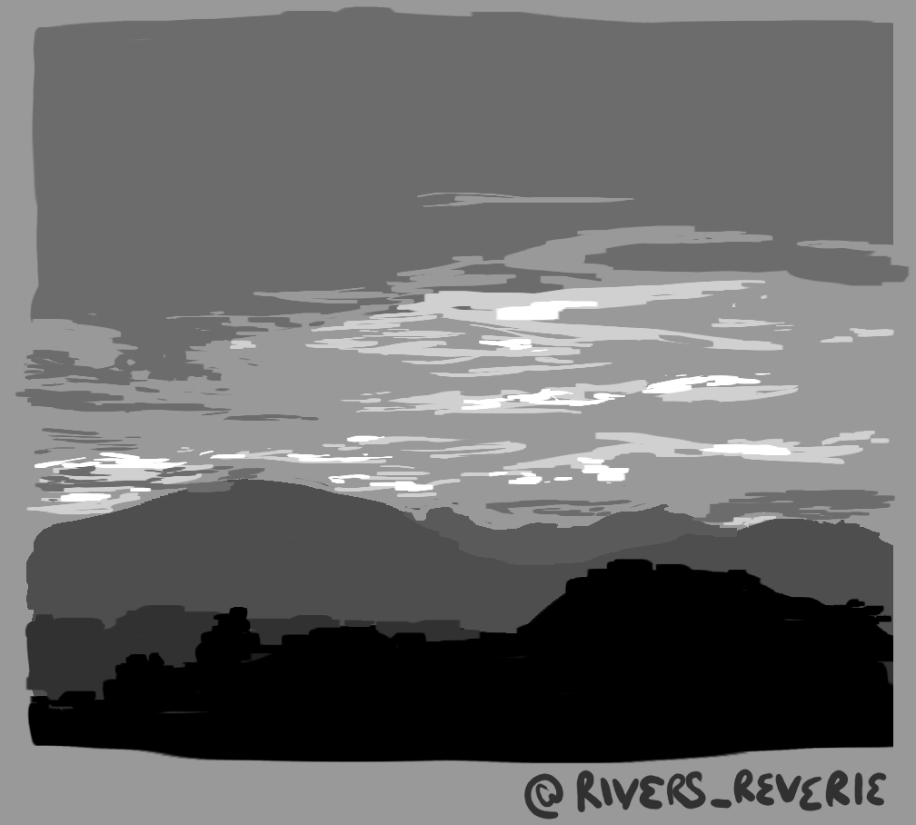
The wonderful paintings that appear every evening as the sun sets are fascinating, and I find myself returning to them again and again. Each one is unique. This sunset painted the lines of clouds in brilliant colors. Now, the secret behind that brilliance lies in the contrast between the shadows and the light on the clouds, making them a perfect subject for a values study.
Once again, blocking in the mountainous forms in the foreground gave a good base to the composition and allowed me to turn my attention to detailing the clouds. For the stacked horizontal forms of the clouds, I used a rectangular brush (included in GIMP standard brush pack) that gave a good edge to each form. I was surprised how well it worked! Even though a few clouds have strange squared-off corners, overall I feel this brush helps a lot with blocking out shapes, without the blurriness or indistinctness you can get with soft round brushes.
Tips
- Start with a midtone gray as the base layer. This makes it easy to quickly block out darker and lighter forms.
- With organic shapes like clouds, loosen up and don’t worry about getting it just right.
- Try out different brushes included in your drawing program. Experimenting with a rectangular brush here helped me quickly block out forms.
- Save time by painting over mistakes instead of erasing: Color-pick the value next to the mistake, and use that as your “eraser.” This combines erasing with filling in the adjacent form, cutting the time required for the fix in half.
Study 5: Sunset at the Beach
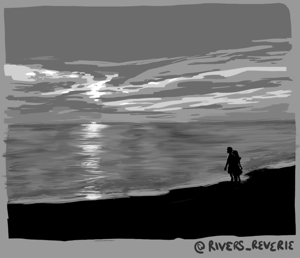
One of my goals with this exercise is to learn to create more drama in my compositions. What could be more dramatic than sunlight playing off the waves? And for the first time, we have characters added to a scene, giving me a chance to play with silhouettes.
While the other four studies were experimental, the composition of this scene benefited from a more structured approach to painting.
First, I blocked out the rough shapes using black for the shoreline, dark gray for the ocean, and the midtone gray of the canvas for the sky. Next came the clouds and sun’s rays. It was important to figure out the clouds first to show what is going to be reflected in the waves.
The waves use a process I learned from a Kanekiru tutorial. Lay down horizontal lines of the colors (in this case, values) you want to use, varying short to long strokes and interweaving them randomly. Then go over the lines with the Smudge tool, again using horizontal strokes, to create the beautiful wave effect. Repeat as necessary, then add final highlights and you’re done!
The silhouettes of the couple were added when the waves were done. The process is simple: block in the shapes, erase where necessary, and add the backlighting from the sun. It took some repetitions of paint, erase, paint, erase before they took shape. The effort was worth it because adding the couple made a story come to life on the canvas. That’s the power of character.
Tips
- Use a new layer when adding new forms over detailed areas like the waves – in this case, the silhouettes. After all that work, it’d be a shame to lose it!
- The backlighting gives definition and clarity to the silhouettes.
- Digital painting programs come with so many tools like blur and smudge. Make use of them for different effects. Here, the smudge tool transformed a messy series of lines into waves.
After experimenting with values studies, I’ve found them to be an interesting and helpful exercise. I love working with color, yet restricting to grayscale allows a focus on composition, form, and value that will no doubt be helpful in bringing to life illustrations that are only ideas for now. I’m planning to add values studies to my regular rotation of exercises as I continue learning how to make better art.
Now over to you!
Have you tried values studies? How did it go for you? Share your experiences in the comments below!
What is your favorite type of study? I’d love to hear your recommendations!
Looking forward to chatting with you!
* * *
Interested in trying values studies? Check out the first post in this series for more tips!
If you enjoyed this post, please consider buying me a coffee.
